
SECTION 5.1 PART 2DOUBLE BAR GRAPHS, STEM &LEAF PLOTS, ANDFREQUENCY TABLES

DISPLAYING DATA
When data is displayed in an organized way, it helps us tobetter understand what we are studying
Ie: Organized data from a BC Lions football game
We can see a lot more information than just who won
© Copyright all rights reserved to Homework depot: www.BCMath.ca


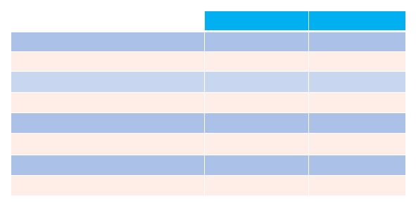
BC
Montreal
Time of Possession
33:28
26:32
Rushing (att - yards)
27-161
19-101
Passing (att – comp-int-yrds)
15-8-0-184
12-6-0-234
Return (yrds)
98
65
First Downs
20
20
Kicking(punts-avg yards)
4-45.0
6-41.8
Fumbles-Fumbles lost
1-0
2-1
Penalties-yards
6-30
9-90

TABLES AND FREQUENCY TABLES
By organizing information into a table it can be easily read &understood.
Looking at unorganized data can be challenging
Ex: Marks obtained in a math test from 30 grade 10 students8, 6, 9, 6, 8, 6, 8, 8, 9, 5, 7, 7, 9, 5, 6, 7, 5, 7, 8, 8, 4, 8, 5, 8, 4, 7, 8, 5, 5, and 7
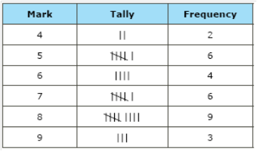
If we present the data in afrequency table, itbecomes easier tounderstand andanalyze.
© Copyright all rights reserved to Homework depot: www.BCMath.ca
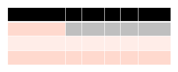
Final
1
2
3
4
Score
BC Lions
9
7
3
6
25
M. Alouettes
0
3
9
2
14
If the range in the data is too big, ie: scores from 20 to 100,there would be too many rows.
In this case we group the data into a range of 10,ie: scores (20 – 30, 31 – 40, 41 – 50, … )
Practice: Make a frequency table with the following data:
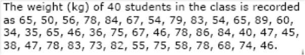
Intervals
Tally
Frequency
31-40
41-50
51-60
61-70
71-80
81-90
© Copyright all rights reserved to Homework depot: www.BCMath.ca
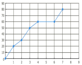
LINE GRAPH
One very common type of graph is a line graph
Dependent variables like distance & cost are measured on they-axis (dependent)
Controlled variable like time is on the x-axis
© Copyright all rights reserved to Homework depot: www.BCMath.ca
What is the distancetravelled in the first 3hours?
How many hours during thetravel is the car at rest?
How much time did it take totravel 60km?
Time (hours)
Distance (km)
DOUBLE BAR GRAPHS:
Double Bar Graphs are used for comparing two sets ofdata across different categories
Ie: Comparing the tests scores between two students
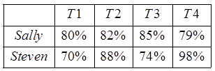
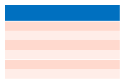
Sally & Steven’s Test Scores
Percentages
Test 1
Test 2
Test 3
Test 4
HOW TO MAKE A STEMPLOT
Ex: The following data indicate the age of the audience in aworkshop. Draw a stem-leaf plot for the data:
Take the tens digitto form the stem
The “ONES” digit
is used to fill in theplot
The smaller digit
on the left and the
bigger on the right
© Copyright all rights reserved to Homework depot: www.BCMath.ca